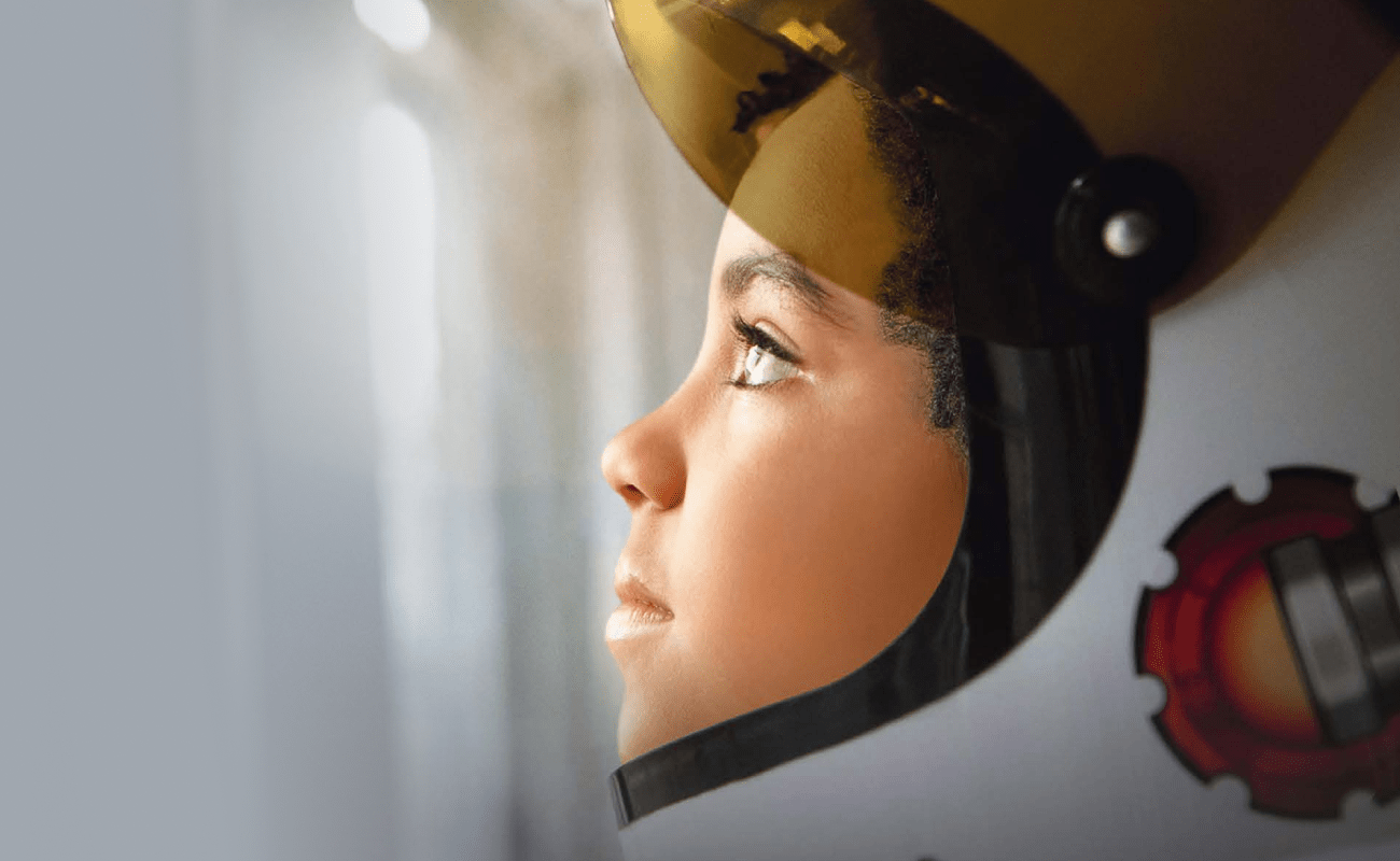
<img height="1" width="1" style="display:none;" alt="" src="https://dc.ads.linkedin.com/collect/?pid=120091&amp;fmt=gif">

What is Responsive Design?

September 25, 2018 Allison Gibbs

SW-mojo-blog-header- 6 Beautiful Examples of Fluid Website Design

Responsive design is the new standard for websites for good reason.

In addition to eliminating navigation frustrations across displays, the content is prioritized and smart. Not only that, but it always looks amazing because images re-position for optimal size and placement.

Better yet, it eliminates friction for the end user by increasing usability, which means better marketing for your business with more conversions in the end

If you're not familiar with responsive design, it's time you learn. 

elfcu-responsive

Can you make my website responsive?

The short answer is "no, not with the flip of a switch." It is possible to make your current website responsive with custom development, but may not be the best idea. A better solution may be to invest in a new website, one where you can strategically plan your content and site structure with modern best practices in mind.

How responsive design works.

Responsive websites are built to adapt to the user's screen. 

No matter what device you are on, an iPad mini or a 27” widescreen display on your desktop, you will have the optimal viewing experience for that device. Pages are easy to read and navigate with minimal scrolling, resizing, and panning. Images display at the optimal size. It pretty much operates like a dream!

Technically speaking, responsive design means that there are multiple fluid grid concepts. This makes page elements size proportionally, not with fixed numbers. 

Responsive design is important because there are thousands of different devices out there that can access your website (some dating back to the early 2000s). The number of these devices, platforms, and browsers are only going to increase as time goes on, and your website needs to be prepared to work with all of them. After all, you want your company to be represented well, regardless of the browser size your website is being viewed on. 

Mobile website vs Apps

You might be thinking that if your company has an app, you can get away without having a responsive design. Technically, you CAN get away with it, but we don't recommend it.

Unlike apps, mobile websites are cross-platform, which means they work great on all mobile devices like iPhones, Droids, and Blackberry devices. With anywhere from 10% to 50% of your audience accessing the web on mobile, it's critical to create a user-friendly experience for those on the go.

Why should you care?

As an end user of this technology, you should be jumping for joy at the idea of responsive design because it means that websites you look at (no matter the device or size) are optimized for your viewing pleasure. (Can I get an "Amen"?)

If you're in the market for a new website, a responsive design is an absolute MUST HAVE. That's why we include it as part of every website we create here at SpinWeb. Sure, it's a ton more work for us, particularly for our designers and developers. But we believe it's worth it in the end because responsive = the future of web design.

You're probably not surprised, then, that Mojo Media Labs' website is responsive. Check it out! Go to the homepage and make your browser window smaller to see what happens. 

If you're looking to update your website so that it's responsive, you know where to find us!


New call-to-action

Allison Gibbs

Allison Gibbs

Allison found her love for marketing while studying business alongside her theatre degree at Indiana University. She loves offering simple solutions to complex problems (and tacos). In her down time, she loves a good run and staying involved in theatre (which landed her in a SuperBowl halftime show alongside Madonna)

Share This: